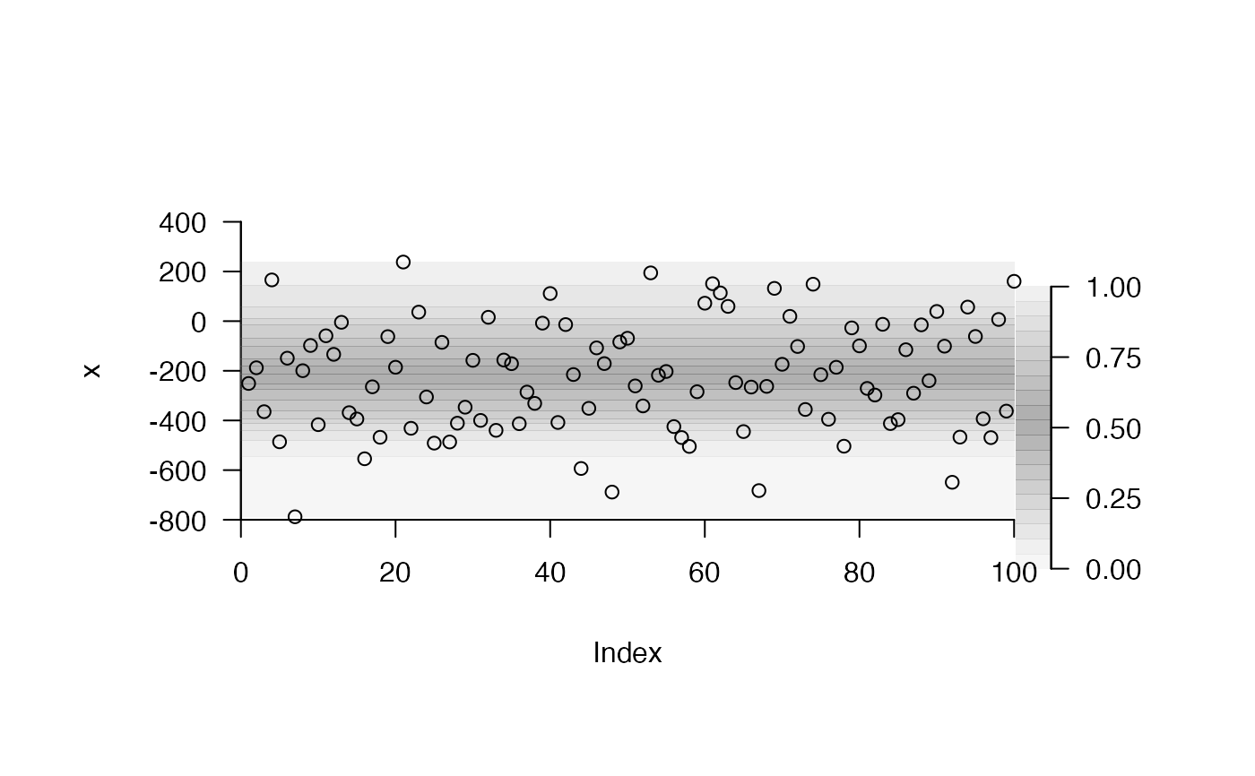
Add shading for the quantiles of observed variation to a plot
Source:R/add_shading_quantiles.R
add_shading_quantiles.RdThis function adds shading to a plot to mark the quantiles of observed variation. Under the default settings, quantiles near the middle of a distribution are shaded more darkly than quantiles towards the edge of the distribution.
add_shading_quantiles(
  x,
  probs = seq(0, 1, length.out = 20),
  cols = scales::alpha("dimgrey", ifelse(probs > 0.5, 1 - probs, probs) + 0.05),
  horiz = TRUE,
  lim,
  return_list = NULL,
  ...
)
Arguments
| x | A numeric vector. |
|---|---|
| probs | A numeric vector of probabilities. |
| cols | A character vector of colours. This should be of the same length as |
| horiz | A logical input that defines whether or not shading is added horizontally or vertically across a plot (i.e., whether |
| lim | A numeric input that defines the horizontal or vertical limits. This is passed to passed to |
| return_list | (depreciated) A logical input that defines whether or not to return a list of outputs (see Value). |
| ... | Additional arguments passed to |
Value
This function adds shading to a plot to show the sample quantiles corresponding to inputted probabilities. A named list of outputs is also returned invisibly. This contains: (1) 'dat', a dataframe with probabilities ('prob'), colours ('col') and quantiles ('quantile'); (2) 'data_legend', a dataframe that contains only probabilities ('x') and colours ('col'); and (3) 'pretty_axis_args', a list of suggested arguments for pretty axes. 'data_legend' and 'pretty_axis_args' can be passed directly to add_colour_bar to add a colour bar to the plot.
Author
Edward Lavender
Examples
# Simulate some normally distributed observations n <- 100 x <- stats::rnorm(100, -200, 200) pp <- par(oma = c(2, 2, 2, 4)) # Create a blank plot with appropriate axis limits axis_ls <- pretty_plot(x, type = "n")#># Add shading for the quantiles of observations, saving the # ... list returned by the function so we can add a colour bar later. asq_ls <- add_shading_quantiles(x, horiz = TRUE, lim = axis_ls[[1]]$lim, border = NA)# Add a colour bar via TeachingDemos::subplot() and # ... prettyGraphics::add_colour_bar() # ... using outputs returned by function: TeachingDemos::subplot(fun = add_colour_bar( data_legend = asq_ls$data_legend, pretty_axis_args = asq_ls$pretty_axis_args ), x = axis_ls[[1]]$lim[2] + 1, y = axis_ls[[2]]$lim[1], size = c(0.2, 2.8), vadj = 0, hadj = 0 )
