Vignette: An introduction to prettyGraphics
Edward Lavender1
29 November 2021
Source:vignettes/introducing_prettyGraphics.Rmd
introducing_prettyGraphics.RmdIntroduction
prettyGraphics is an R package designed to make the production of plots and data exploration easier, more flexible and prettier using similar functions to familiar favourites in base R. The package is based on a number of functions which act as ‘building blocks’; these help to define the initial arguments of a plot and then add elements to a plot sequentially. A number of integrative functions link these functions together to facilitate the production of prettier versions of common plot types (e.g. a more flexible implementation of graphics::plot() with pretty axes) as well as more specialised plot types. Notable functionality of prettyGraphics includes the following:
-
The definition of pretty axes. The definition of ‘pretty’ axes (i.e., axes with intelligible tick mark labels that are positioned in appropriate, adjoining positions, rather than as an approximate box around a plot) underlies publication-quality plots but these are not implemented automatically by base R.
pretty_axis()is a very flexible function which makes this possible. A few other functions, such assci_notation(), which can be used to add labels with scientific notation to a plot (i.e. \(a \times 10^b\) rather than \(ae^b\)), andadd_lagging_point_zero(), which brings all numbers up to the same number of decimal places, complement this function.add_grid_rect_xy()can be used to add a rectangular grid at user-defined positions (e.g. coinciding with axis labels), to aid interpretation. -
Data exploration. Some functions facilitate exploration of the relationships among variables. For example, in base
R, it’s easy to add lines to a plot to illustrate a relationship. However, it is a more long-winded process to add a line that is coloured by the values of a third variable, followed by a highly customisable colour bar legend, to illustrate the relationship between the response and more than one explanatory variable. This essential part of data exploration is implemented byadd_lines()andadd_colour_bar(). Adding shading to a plot is another way to illustrate possible relationships, especially between a response/explanatory variable and a factor. For example, in plots of depth time series, it is often useful to add shading delineating day/night periods. Adding shading to a plot is made easy withadd_shading_bar(). -
Statistical inference. The definition and addition of statistical summarises or model predictions to a plot can help to reveal signal from noise or in the interpretation and evaluation of models. For example, for continuous data, it may be helpful to calculate the mean value, the minimum, the maximum, the 89 % quantiles or another statistic in a sequence of bins \(n\) units in width (e.g. \(10 cm\), \(0.5 ms^{-2}\), \(12 hours\), etc.). This is facilitated by
summmarise_in_bins()andadd_lines(). Alternatively, the addition of model predictions (e.g. fitted values ± confidence intervals) to observed data is facilitated bylist_CIs()andadd_error_envelope(). For discrete explanatory variables, error bars can be added usingadd_error_bars(). -
Integrative functions. Some functions use the power of building block functions to create prettier versions of standard plots, such as histograms or density plots, and more specialised plot types, such as plots of model residuals or spatial data. For example,
pretty_plot()functions likegraphics::plot()but usespretty_axis()to define pretty axes and is more flexible.
The aim of this vignette is to introduce some of these functions, to highlight their flexibility and their use, and to show how they can be strung together to produce prettier plots designed to shed light on interesting questions. For each function, much more detail is provided in the help files.
Package set up
Installation and load
First, install and load prettyGraphics:
# Install the development version of prettyGraphics from GitHub:
# devtools::install_github("edwardlavender/prettyGraphics")
# Load package:
library(prettyGraphics)
This vignette also uses functions from the following packages, which you may need to install before loading and attaching:
Basic motivation
The primary motivation of the package is to make publication quality plots by default, as in these simple examples:
# pretty_plot()
pp <- par(mfrow = c(3, 2))
graphics::plot(x, y, main = "plot(x, y)")
pretty_plot(x, y, main = "pretty_plot(x, y)")

# pretty_boxplot()
graphics::boxplot(y ~ x, data = d, main = "boxplot(y ~ x)")
pretty_boxplot(d$x, d$y, main = "pretty_boxplot(x, y)")

# pretty_hist
hist(x,  breaks = 5, main = "hist(x)")
pretty_hist(x, breaks = 5, main = "pretty_hist(x)")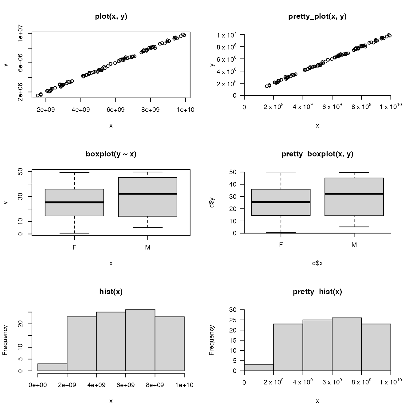
par(pp)R prerequisites
Before proceeding, let’s introduce a few tricks used by prettyGraphics and this vignette with which it may be helpful to be familiar.
lists and do.call()
The use of lists and do.call() is a backbone of prettyGraphics. Lists are very useful objects in R which can store all sorts of objects. Lists contain elements, which may be named, that contain these objects. For example, in the following list, the first element is named a and it contains the number 10. The second element is unnamed and contains 0; the third element is unnamed and contains a dataframe; and the fourth element is an unnamed list which contains the number 16:
l <- list(a = 10, 0, data.frame(x = 1, y = 2), list(16))
utils::str(l)
#> List of 4
#>  $ a: num 10
#>  $  : num 0
#>  $  :'data.frame':   1 obs. of  2 variables:
#>   ..$ x: num 1
#>   ..$ y: num 2
#>  $  :List of 1
#>   ..$ : num 16
One particularly useful feature of lists is that they can be used to hold function arguments. Specifically, a named list of arguments can be passed to a function via do.call() for the that function to evaluate. In the following example, I generate a collection of numbers and then I use the pretty() function to define a pretty sequence across the range of these numbers, by specifying the x and n arguments of pretty() in a named list:
# generate numbers
x <- stats::runif(10, 0, 10)
# do.call implementation
pretty_args <- list(x = x, n = 5)
names(pretty_args); utils::str(pretty_args)
#> [1] "x" "n"
#> List of 2
#>  $ x: num [1:10] 2.68 2.19 5.17 2.69 1.81 ...
#>  $ n: num 5
p1 <- do.call(pretty, pretty_args)
# standard implementation
p2 <- pretty(x, n = 5)
# do.call() and standard implementation are idential:
p1; p2; identical(p1, p2)
#> [1] 1 2 3 4 5 6 7 8
#> [1] 1 2 3 4 5 6 7 8
#> [1] TRUE
prettyGraphics makes use of this functionality. For example, there is a function, pretty_axis() which can make pretty axes. This includes an argument, pretty, which takes in a list of arguments that are passed to pretty(), lubridate::pretty_dates() or another function to make pretty axes. Here is a canned example in which I add pretty axes to side 1 and 2 of a plot using pretty_axis(). Each axis has approximately five pretty breaks, which the function defines by default based on the data to be plotted (x and y here). In this case, since x and y are numeric, the named list of arguments is passed to pretty() within the function to define the pretty sequence. pretty_axis() then does some more work to define axis placement and then adds the axes to the plot.
x <- runif(10, 0, 10)
y <- runif(10, 0, 10)
plot(x, y, xlim = c(0, 10), ylim = c(0, 10), axes = FALSE)
pretty_axis(side = 1:2, x = list(x, y), pretty = list(n = 5), add = TRUE)
#> $`1`
#> $`1`$axis
#> $`1`$axis$at
#> [1]  0  2  4  6  8 10
#>
#> $`1`$axis$labels
#> [1]  0  2  4  6  8 10
#>
#> $`1`$axis$side
#> [1] 1
#>
#> $`1`$axis$las
#> [1] TRUE
#>
#> $`1`$axis$pos
#> [1] 0
#>
#>
#> $`1`$lim
#> [1]  0 10
#> attr(,"user")
#> [1] FALSE FALSE
#>
#>
#> $`2`
#> $`2`$axis
#> $`2`$axis$at
#> [1]  0  2  4  6  8 10
#>
#> $`2`$axis$labels
#> [1]  0  2  4  6  8 10
#>
#> $`2`$axis$side
#> [1] 2
#>
#> $`2`$axis$las
#> [1] TRUE
#>
#> $`2`$axis$pos
#> [1] 0
#>
#>
#> $`2`$lim
#> [1]  0 10
#> attr(,"user")
#> [1] FALSE FALSE
Under-the-hood, pretty_axis() loops over any nested lists, which means each axis can be controlled independently via a nested list. For example, to specify the x and y axes with different numbers of pretty breaks, the following code could be used:
plot(x, y, xlim = c(0, 10), ylim = c(0, 10), axes = FALSE)
pretty_axis(side = 1:2, x = list(x, y), pretty = list(list(n = 5), list(n = 10)), add = TRUE)
#> $`1`
#> $`1`$axis
#> $`1`$axis$at
#> [1]  0  2  4  6  8 10
#>
#> $`1`$axis$labels
#> [1]  0  2  4  6  8 10
#>
#> $`1`$axis$side
#> [1] 1
#>
#> $`1`$axis$las
#> [1] TRUE
#>
#> $`1`$axis$pos
#> [1] 0
#>
#>
#> $`1`$lim
#> [1]  0 10
#> attr(,"user")
#> [1] FALSE FALSE
#>
#>
#> $`2`
#> $`2`$axis
#> $`2`$axis$at
#>  [1]  0  1  2  3  4  5  6  7  8  9 10
#>
#> $`2`$axis$labels
#>  [1]  0  1  2  3  4  5  6  7  8  9 10
#>
#> $`2`$axis$side
#> [1] 2
#>
#> $`2`$axis$las
#> [1] TRUE
#>
#> $`2`$axis$pos
#> [1] 0
#>
#>
#> $`2`$lim
#> [1]  0 10
#> attr(,"user")
#> [1] FALSE FALSE
There are many more examples of the power and flexibility of pretty_axis() in the help file (use ?pretty_axis).
Active binding and %<a-%
This vignette also uses a trick called active binding to minimise code repetition. This is implemented via the pryr package. With active binding, the user can save code in an object. When the object is executed, the code that is bound to that object is then executed. Consider the following example. First, we’ll make a plot and actively bind this to an object.
# Create active binding; note that no object will show at this stage.
active_binding_example %<a-% plot(x, y)
Then, after executing the object, the code is evaluated and the plot becomes visible:
active_binding_example
Example dataset
To illustrate some of the functionality of prettyGraphics, I will mainly use an example ecological dataset comprising a sample of a depth and temperature observations at defined time stamps collected from two flapper skate, Dipturus intermedius, off the West Coast of Scotland by Scottish Natural Heritage and Marine Scotland Science. We’ll load these data and focus on one individual for simplicity. For visualisation purposes, we’ll also define a new column that contains depth expressed as a negative number:
df <- dat_flapper[which(dat_flapper$id == "A"), ]
df$dn <- df$depth*-1
utils::head(df, 3)
#>             timestamp temp  depth id      dn
#> 1 2016-05-08 23:00:00 8.56 108.29  A -108.29
#> 2 2016-05-08 23:02:00 8.56 107.38  A -107.38
#> 3 2016-05-08 23:04:00 8.59 106.94  A -106.94
utils::str(df)
#> 'data.frame':    10081 obs. of  5 variables:
#>  $ timestamp: POSIXct, format: "2016-05-08 23:00:00" "2016-05-08 23:02:00" ...
#>  $ temp     : num  8.56 8.56 8.59 8.56 8.56 8.56 8.56 8.59 8.56 8.56 ...
#>  $ depth    : num  108 107 107 106 104 ...
#>  $ id       : Factor w/ 2 levels "A","B": 1 1 1 1 1 1 1 1 1 1 ...
#>  $ dn       : num  -108 -107 -107 -106 -104 ...
The definition of pretty axes
An introduction to pretty_axis()
The first step towards building a publication-quality plot is the definition of suitable axis limits and the addition of suitable axes in appropriate positions. In prettyGraphics, pretty_axis() is the function which controls axes. We will start by implementing this function directly, but later in the vignette, we will move on to using wrapper functions, like pretty_plot() which can handle these steps automatically if desired.
Consider the following example, in which the default plot (produced by graphics::plot()) is contrasted with one created using pretty_axis(). Note that I choose to plot the x axis on the \(3^{rd}\) side in this and following examples so that we can visualise this axis as the ‘sea surface’, from which we can visualise animal movement into shallower or deeper water.
#### Set plotting window
pp <- par(mfrow = c(2, 1))

#### Default plot of (negated) depth against time
plot(df$timestamp, df$dn,
     type = "l", xlab = "Time", ylab = "Depth")

#### Prettier plot
# First use pretty_axis to define a list of outputs which include axis limits
axis_ls <- pretty_axis(side = c(3, 2),
                       x = list(df$timestamp, df$dn),
                       axis = list(las = TRUE),
                       pretty = list(n = 5),
                       add = FALSE)
# We can use the limits defined by pretty_axis() to create the plot
plot1 %<a-% plot(df$timestamp, df$dn,
                 type = "l",
                 xlab = "Time", ylab = "Depth",
                 axes = FALSE,
                 xlim = axis_ls[[1]]$lim, ylim = axis_ls[[2]]$lim,
                 ); plot1
# The list of outputs can be passed back to pretty_axis() to add pretty_axes()
# Note the automatic pretty labels and adjoined placing:
add_pretty_axis %<a-% pretty_axis(axis_ls = axis_ls, add = TRUE)
add_pretty_axis
#> $`3`
#> $`3`$axis
#> $`3`$axis$las
#> [1] TRUE
#>
#> $`3`$axis$at
#> [1] "2016-05-08 UTC" "2016-05-10 UTC" "2016-05-12 UTC" "2016-05-14 UTC"
#> [5] "2016-05-16 UTC" "2016-05-18 UTC" "2016-05-20 UTC" "2016-05-22 UTC"
#> [9] "2016-05-24 UTC"
#>
#> $`3`$axis$side
#> [1] 3
#>
#> $`3`$axis$pos
#> [1] 0
#>
#>
#> $`3`$lim
#> [1] "2016-05-08 UTC" "2016-05-24 UTC"
#>
#>
#> $`2`
#> $`2`$axis
#> $`2`$axis$las
#> [1] TRUE
#>
#> $`2`$axis$at
#> [1] -250 -200 -150 -100  -50    0
#>
#> $`2`$axis$labels
#> [1] -250 -200 -150 -100  -50    0
#>
#> $`2`$axis$side
#> [1] 2
#>
#> $`2`$axis$pos
#> [1] "2016-05-08 UTC"
#>
#>
#> $`2`$lim
#> [1] -250    0
#> attr(,"user")
#> [1] FALSE FALSE
par(pp)
pretty_axis() has lots of customisation options which are exemplified in the help file (use ?pretty_axis).
Add grids: add_grid()
To aid interpretation, it is often helpful to add a regular grid to a plot at user-specified positions. Here, we’ll add a grid coinciding with pretty axis locations:
plot1; add_pretty_axis;
#> $`3`
#> $`3`$axis
#> $`3`$axis$las
#> [1] TRUE
#>
#> $`3`$axis$at
#> [1] "2016-05-08 UTC" "2016-05-10 UTC" "2016-05-12 UTC" "2016-05-14 UTC"
#> [5] "2016-05-16 UTC" "2016-05-18 UTC" "2016-05-20 UTC" "2016-05-22 UTC"
#> [9] "2016-05-24 UTC"
#>
#> $`3`$axis$side
#> [1] 3
#>
#> $`3`$axis$pos
#> [1] 0
#>
#>
#> $`3`$lim
#> [1] "2016-05-08 UTC" "2016-05-24 UTC"
#>
#>
#> $`2`
#> $`2`$axis
#> $`2`$axis$las
#> [1] TRUE
#>
#> $`2`$axis$at
#> [1] -250 -200 -150 -100  -50    0
#>
#> $`2`$axis$labels
#> [1] -250 -200 -150 -100  -50    0
#>
#> $`2`$axis$side
#> [1] 2
#>
#> $`2`$axis$pos
#> [1] "2016-05-08 UTC"
#>
#>
#> $`2`$lim
#> [1] -250    0
#> attr(,"user")
#> [1] FALSE FALSE
add_grid_rect_xy(x = axis_ls[[1]]$axis$at, y = axis_ls[[2]]$axis$at, col = scales::alpha("dimgrey", 0.8))
add_lines(x = df$timestamp, y1 = df$dn)
add_pretty_axis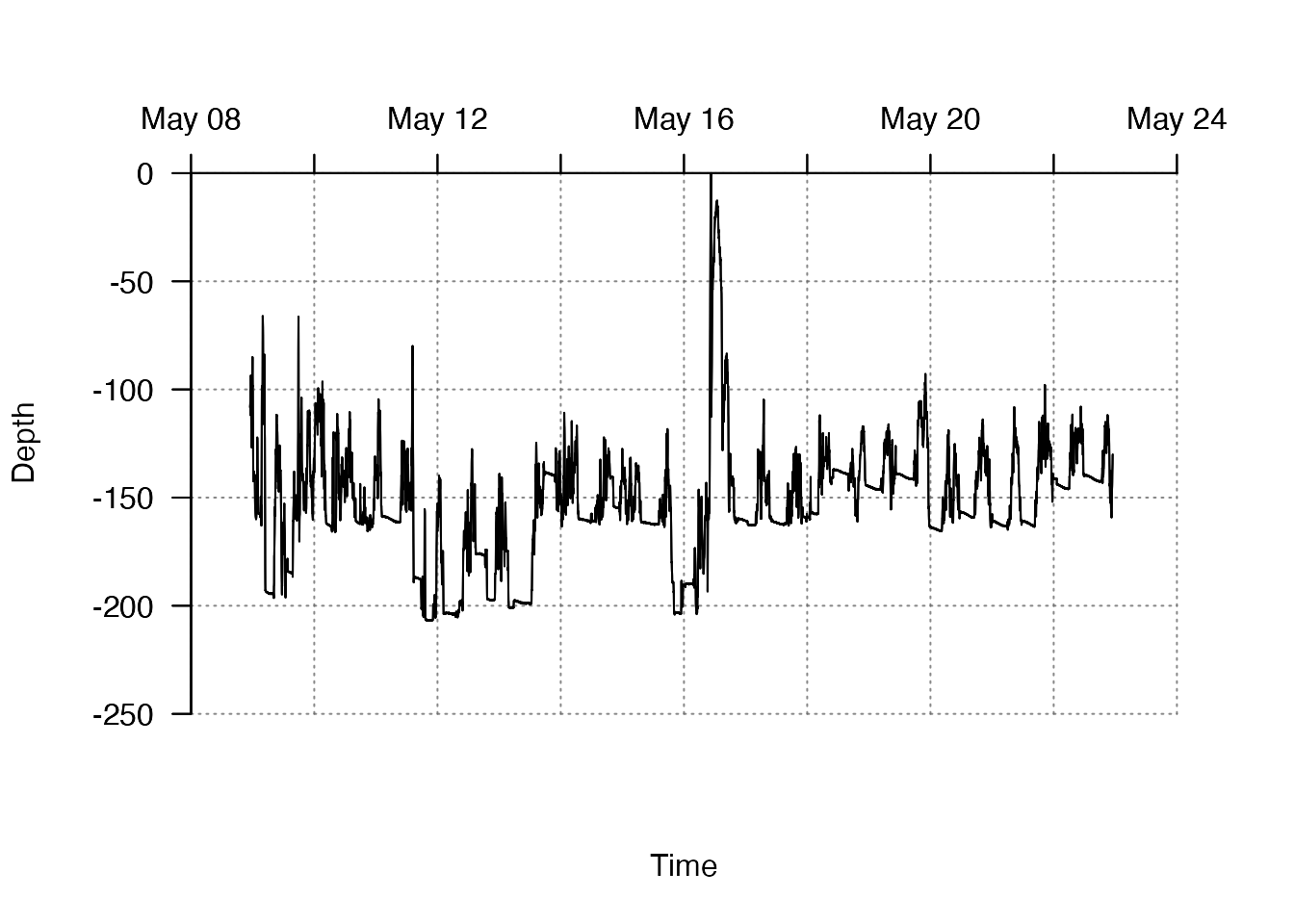
#> $`3`
#> $`3`$axis
#> $`3`$axis$las
#> [1] TRUE
#>
#> $`3`$axis$at
#> [1] "2016-05-08 UTC" "2016-05-10 UTC" "2016-05-12 UTC" "2016-05-14 UTC"
#> [5] "2016-05-16 UTC" "2016-05-18 UTC" "2016-05-20 UTC" "2016-05-22 UTC"
#> [9] "2016-05-24 UTC"
#>
#> $`3`$axis$side
#> [1] 3
#>
#> $`3`$axis$pos
#> [1] 0
#>
#>
#> $`3`$lim
#> [1] "2016-05-08 UTC" "2016-05-24 UTC"
#>
#>
#> $`2`
#> $`2`$axis
#> $`2`$axis$las
#> [1] TRUE
#>
#> $`2`$axis$at
#> [1] -250 -200 -150 -100  -50    0
#>
#> $`2`$axis$labels
#> [1] -250 -200 -150 -100  -50    0
#>
#> $`2`$axis$side
#> [1] 2
#>
#> $`2`$axis$pos
#> [1] "2016-05-08 UTC"
#>
#>
#> $`2`$lim
#> [1] -250    0
#> attr(,"user")
#> [1] FALSE FALSE
See ?add_grid_rect_xy() for further options.
Data exploration
Add lines: add_lines()
Now that we have visualised the raw time series, we might start to explore relationships among variables. In this case, we have a couple of continuous explanatory variables and it might be helpful to consider not only how depth changes through time, but whether this change is related to temperature. To do this, one option is to colour the depth time series by temperature:
#### Define plotting window
pp <- par(oma = c(1, 1, 1, 4))

#### Plot the graph with pretty limits, hiding the line
plot2 %<a-% plot(df$timestamp, df$dn,
                 type = "n",
                 xlab = "Time", ylab = "Depth",
                 axes = FALSE,
                 xlim = axis_ls[[1]]$lim, ylim = axis_ls[[2]]$lim,
                 ); plot2

#### Use add_lines() to add a line coloured by temperature.
# The function outputs a list of arguments, which we'll save because we can use them to create
# ... a colour bar later (e.g. this includes pretty axis labels controlled by arguments to pretty_axis_args).
dat4colbar <-
  add_lines(x = df$timestamp,
            y1 = df$dn,
            y2 = df$temp,
            f = grDevices::colorRampPalette(c("red", "blue")),
            pretty_axis_args = list(pretty = list(n = 10), axis = list(las = TRUE)))

#### Use add_colour_bar() within TeachingDemos::subplot()
# ... to add the colour bar as a subplot
utils::str(dat4colbar)
#> List of 2
#>  $ data_legend:'data.frame': 99 obs. of  2 variables:
#>   ..$ x  : num [1:99] 8.4 8.42 8.44 8.47 8.49 ...
#>   ..$ col: chr [1:99] "#FF0000" "#FC0002" "#F90005" "#F70007" ...
#>  $ axis_legend:List of 1
#>   ..$ 4:List of 2
#>   .. ..$ axis:List of 5
#>   .. .. ..$ las   : logi TRUE
#>   .. .. ..$ pos   : num 1
#>   .. .. ..$ at    : num [1:12] 8.4 8.6 8.8 9 9.2 9.4 9.6 9.8 10 10.2 ...
#>   .. .. ..$ labels: num [1:12] 8.4 8.6 8.8 9 9.2 9.4 9.6 9.8 10 10.2 ...
#>   .. .. ..$ side  : num 4
#>   .. ..$ lim : num [1:2] 8.4 10.6
#>   .. .. ..- attr(*, "user")= logi [1:2] FALSE FALSE
TeachingDemos::subplot(x = axis_ls[[1]]$lim[2],
               y = axis_ls[[2]]$lim[1],
               size = c(0.2, 2.5),
               vadj = 0,
               hadj = 0,
  fun = add_colour_bar(data_legend = dat4colbar$data_legend,
                       pretty_axis_args = dat4colbar$axis_legend
                       )
  )
#### Add pretty axes back to the plot
add_pretty_axis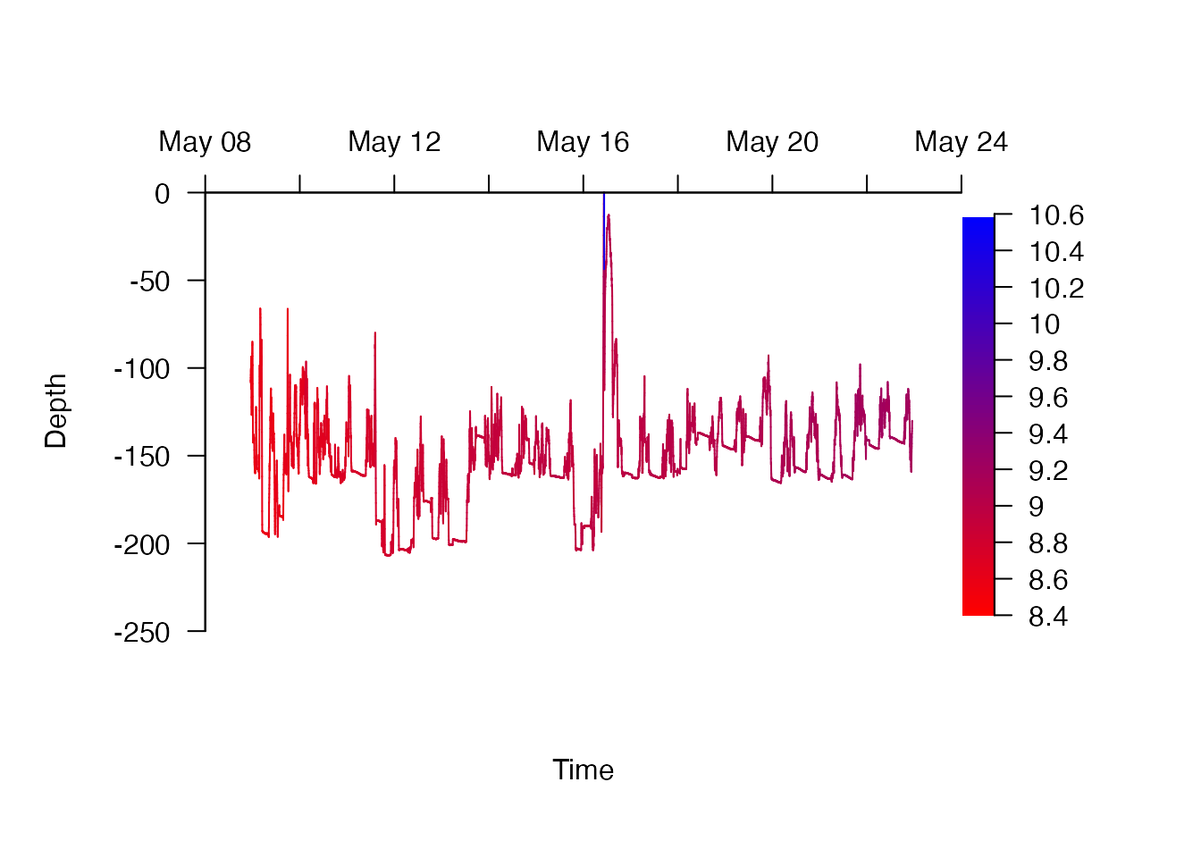
#> $`3`
#> $`3`$axis
#> $`3`$axis$las
#> [1] TRUE
#>
#> $`3`$axis$at
#> [1] "2016-05-08 UTC" "2016-05-10 UTC" "2016-05-12 UTC" "2016-05-14 UTC"
#> [5] "2016-05-16 UTC" "2016-05-18 UTC" "2016-05-20 UTC" "2016-05-22 UTC"
#> [9] "2016-05-24 UTC"
#>
#> $`3`$axis$side
#> [1] 3
#>
#> $`3`$axis$pos
#> [1] 0
#>
#>
#> $`3`$lim
#> [1] "2016-05-08 UTC" "2016-05-24 UTC"
#>
#>
#> $`2`
#> $`2`$axis
#> $`2`$axis$las
#> [1] TRUE
#>
#> $`2`$axis$at
#> [1] -250 -200 -150 -100  -50    0
#>
#> $`2`$axis$labels
#> [1] -250 -200 -150 -100  -50    0
#>
#> $`2`$axis$side
#> [1] 2
#>
#> $`2`$axis$pos
#> [1] "2016-05-08 UTC"
#>
#>
#> $`2`$lim
#> [1] -250    0
#> attr(,"user")
#> [1] FALSE FALSE
par(pp)
add_lines() and add_colour_bar() have lots of customisation options which are exemplified in the help file (use ?add_lines() and ?add_colour_bar()). For example, we could easily change the colour scheme by supplying a different function to create colours, or adjust the axis labels on the colour bar by passing arguments to pretty_axis_args. (Under-the-hood, this calls do.call() to evaluate additional arguments).
#### Define plotting window (as above)
pp <- par(oma = c(1, 1, 1, 4))

#### Plot the graph (as above)
plot2

#### Use add_lines() to add a line coloured by temperature.
# This time, we'll adjust the number of breaks desired on the colour bar axis
# ... and the function used to colour the time series:
dat4colbar <-
  add_lines(x = df$timestamp,
            y1 = df$dn,
            y2 = df$temp,
            f = viridis::viridis,
            pretty_axis_args = list(pretty = list(n = 15), axis = list(las = TRUE)))

#### Use add_colour_bar() (as above)
TeachingDemos::subplot(x = axis_ls[[1]]$lim[2],
               y = axis_ls[[2]]$lim[1],
               size = c(0.2, 2.5),
               vadj = 0,
               hadj = 0,
  fun = add_colour_bar(data_legend = dat4colbar$data_legend,
                       pretty_axis_args = dat4colbar$axis_legend
                       )
  )
#### Add pretty axes back to the plot
add_pretty_axis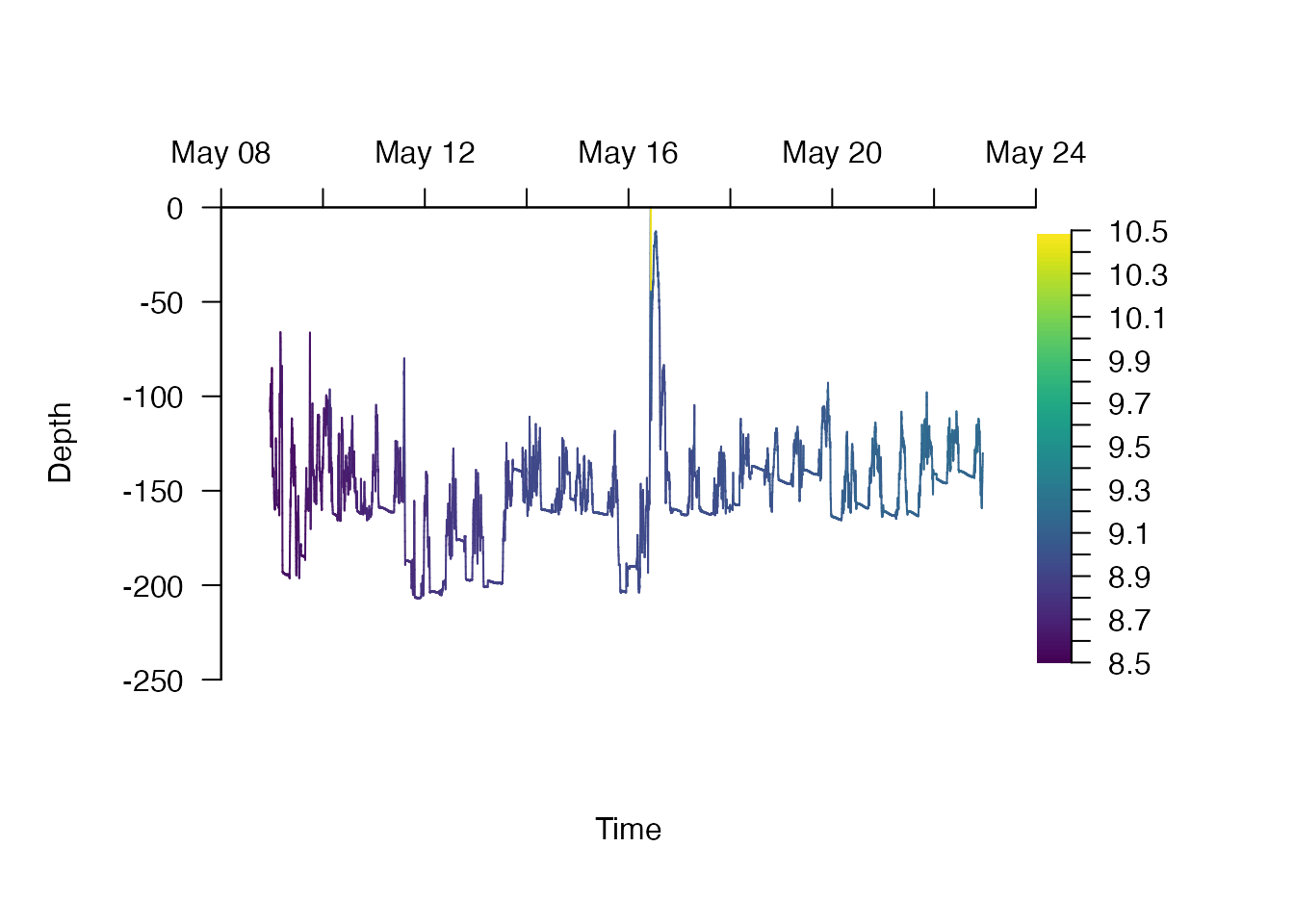
#> $`3`
#> $`3`$axis
#> $`3`$axis$las
#> [1] TRUE
#>
#> $`3`$axis$at
#> [1] "2016-05-08 UTC" "2016-05-10 UTC" "2016-05-12 UTC" "2016-05-14 UTC"
#> [5] "2016-05-16 UTC" "2016-05-18 UTC" "2016-05-20 UTC" "2016-05-22 UTC"
#> [9] "2016-05-24 UTC"
#>
#> $`3`$axis$side
#> [1] 3
#>
#> $`3`$axis$pos
#> [1] 0
#>
#>
#> $`3`$lim
#> [1] "2016-05-08 UTC" "2016-05-24 UTC"
#>
#>
#> $`2`
#> $`2`$axis
#> $`2`$axis$las
#> [1] TRUE
#>
#> $`2`$axis$at
#> [1] -250 -200 -150 -100  -50    0
#>
#> $`2`$axis$labels
#> [1] -250 -200 -150 -100  -50    0
#>
#> $`2`$axis$side
#> [1] 2
#>
#> $`2`$axis$pos
#> [1] "2016-05-08 UTC"
#>
#>
#> $`2`$lim
#> [1] -250    0
#> attr(,"user")
#> [1] FALSE FALSE
par(pp)
For these sample data, this exploration suggests that the predominant axis of variation in exploited temperatures is through time, rather than through space (i.e. as the skate move shallower/deeper over short periods of time). Without any modelling, this suggests that one explanation for movements between shallow and deep water for some marine species, the so-called ‘hunt-warm, rest-cold’ hypothesis in which individuals are hypothesised to descend into deeper waters to maximise digestive efficiency following feeding, is probably not a suitable explanation for the vertical movements of this individual.
Add shading: add_shading_bar()
Colouring lines by the value of a third variable is one useful approach in the exploration of relationships. For discrete variables, adding rectangular shading demarking switches between values is also useful for inference. For instance, in the following example, we add vertical blocks of shading delineating day/night periods:
#### Reproduce blank plot with pretty limits
plot2

#### Define the positions of day/night periods using define_time_blocks()
dat_block <- define_time_blocks(t1 = min(df$timestamp),
                                t2 = max(df$timestamp),
                                type = "diel",
                                type_args = list(lat = -5, lon = 56),
                                col = c("white", "dimgrey"))

#### These can also be generated by the user. All that is required is that
# ... the positions (and colours) of the blocks is specified, here by x1, x2 and col:
utils::str(dat_block)
#> 'data.frame':    31 obs. of  3 variables:
#>  $ x1 : POSIXct, format: "2016-05-08 23:00:00" "2016-05-08 23:00:00" ...
#>  $ x2 : POSIXct, format: "2016-05-08 23:00:00" "2016-05-08 23:00:00" ...
#>  $ col: chr  "white" "dimgrey" "white" "dimgrey" ...
#### Add shading to the plot, with vertical bars exactly within pretty y axis limits
add_shading_bar(dat_block$x1,
            dat_block$x2,
            horiz = FALSE,
            lim = axis_ls[[2]]$lim,
            col = dat_block$col,
            border = FALSE) %>% invisible()

#### Add back depth time series
add_lines(x = df$timestamp, y1 = df$dn)

#### Add pretty axes
add_pretty_axis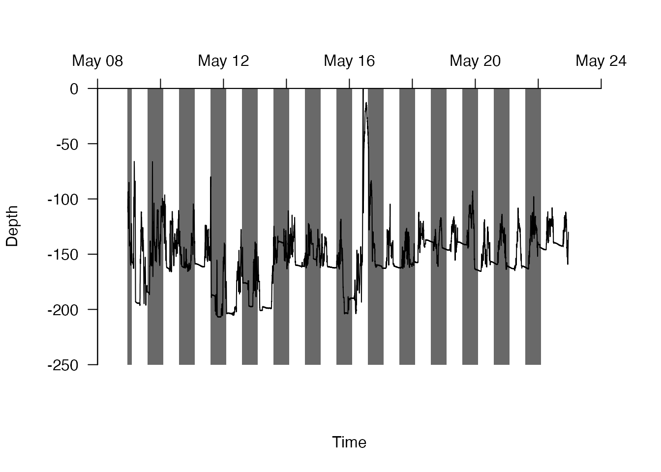
#> $`3`
#> $`3`$axis
#> $`3`$axis$las
#> [1] TRUE
#>
#> $`3`$axis$at
#> [1] "2016-05-08 UTC" "2016-05-10 UTC" "2016-05-12 UTC" "2016-05-14 UTC"
#> [5] "2016-05-16 UTC" "2016-05-18 UTC" "2016-05-20 UTC" "2016-05-22 UTC"
#> [9] "2016-05-24 UTC"
#>
#> $`3`$axis$side
#> [1] 3
#>
#> $`3`$axis$pos
#> [1] 0
#>
#>
#> $`3`$lim
#> [1] "2016-05-08 UTC" "2016-05-24 UTC"
#>
#>
#> $`2`
#> $`2`$axis
#> $`2`$axis$las
#> [1] TRUE
#>
#> $`2`$axis$at
#> [1] -250 -200 -150 -100  -50    0
#>
#> $`2`$axis$labels
#> [1] -250 -200 -150 -100  -50    0
#>
#> $`2`$axis$side
#> [1] 2
#>
#> $`2`$axis$pos
#> [1] "2016-05-08 UTC"
#>
#>
#> $`2`$lim
#> [1] -250    0
#> attr(,"user")
#> [1] FALSE FALSE
?define_time_blocks() and ?add_shading_bar() provide further information about these functions. In this case, adding shading reveals that this individual often seems to ascend at night – a common behaviour in marine organisms termed diel vertical migration – but this behaviour is highly variable, both in extent and direction (i.e. sometimes the individual is shallower in the day). These insights from data exploration help build understanding, in this case of the movements of a poorly studied and Critically Endangered elasmobranch.
Statistical inference
Add statistical summarises: summarise_in_bins()
Statistical summaries can also aid interpretation. summarise_in_bins() can be used to calculate summary statistics for continuous data in user-specified bins or breaks. With the argument shift = TRUE, the resulting summary statistics are shifted to the middle value of each bin, reflecting that they are a summary across that bin. With to_plot = TRUE additional checks are implemented to ensure the resulting summaries are retained within plot limits. For example, we can examine the change in depth in 12 hour intervals as follows:
#### Reproduct plot
plot1
# Summarise depth in 12 hour bins
# and define a list of summary statistics, one for each function supplied:
summaries <- summarise_in_bins(x = df$timestamp,
                               y = df$dn,
                               bin = "12 hours",
                               funs = list(mean = mean, min = min, max = max),
                               shift = TRUE,
                               to_plot = TRUE)
utils::str(summaries)
#> List of 3
#>  $ mean:'data.frame':    28 obs. of  3 variables:
#>   ..$ bin : POSIXct[1:28], format: "2016-05-09 05:00:00" "2016-05-09 17:00:00" ...
#>   ..$ stat: num [1:28] -150 -156 -139 -152 -151 ...
#>   ..$ fun : chr [1:28] "mean" "mean" "mean" "mean" ...
#>  $ min :'data.frame':    28 obs. of  3 variables:
#>   ..$ bin : POSIXct[1:28], format: "2016-05-09 05:00:00" "2016-05-09 17:00:00" ...
#>   ..$ stat: num [1:28] -196 -196 -166 -166 -162 ...
#>   ..$ fun : chr [1:28] "min" "min" "min" "min" ...
#>  $ max :'data.frame':    28 obs. of  3 variables:
#>   ..$ bin : POSIXct[1:28], format: "2016-05-09 05:00:00" "2016-05-09 17:00:00" ...
#>   ..$ stat: num [1:28] -66 -66.3 -96.3 -110.4 -104.5 ...
#>   ..$ fun : chr [1:28] "max" "max" "max" "max" ...

#### Add statistical summaries to the plot
# Define a sequence of colours for each summary statistic
cols <- c("red", "blue", "blue")
# Add the values of each summary statistic to the plot as a coloured line:
mapply(summaries, cols, FUN = function(foo, col){
  add_lines(foo$bin, foo$stat, col = col, lwd = 1.5)
}) %>% invisible()

#### Add back pretty axes as usual
add_pretty_axis
#> $`3`
#> $`3`$axis
#> $`3`$axis$las
#> [1] TRUE
#>
#> $`3`$axis$at
#> [1] "2016-05-08 UTC" "2016-05-10 UTC" "2016-05-12 UTC" "2016-05-14 UTC"
#> [5] "2016-05-16 UTC" "2016-05-18 UTC" "2016-05-20 UTC" "2016-05-22 UTC"
#> [9] "2016-05-24 UTC"
#>
#> $`3`$axis$side
#> [1] 3
#>
#> $`3`$axis$pos
#> [1] 0
#>
#>
#> $`3`$lim
#> [1] "2016-05-08 UTC" "2016-05-24 UTC"
#>
#>
#> $`2`
#> $`2`$axis
#> $`2`$axis$las
#> [1] TRUE
#>
#> $`2`$axis$at
#> [1] -250 -200 -150 -100  -50    0
#>
#> $`2`$axis$labels
#> [1] -250 -200 -150 -100  -50    0
#>
#> $`2`$axis$side
#> [1] 2
#>
#> $`2`$axis$pos
#> [1] "2016-05-08 UTC"
#>
#>
#> $`2`$lim
#> [1] -250    0
#> attr(,"user")
#> [1] FALSE FALSE
Further information is provided in the help file (see ?summarise_in_bins()). Here, these simple summaries help to demonstrate that there is no clear, overall trend in the mean depth or the variation in depth through time for this individual over a two week period. Small movements seem to occur frequently within 12 hour windows, but their overall extent is relatively stable (except in the middle of the time series, when the individual rapidly ascended to the surface; at this point the individual was re-caught and released).
Add model predictions: list_CIs() and add_error_envelope()
During or following data exploration, models are useful tools to elucidate trends and relationships. To evaluate the performance of models, it is often useful to plot model predictions ontop of observed data. With these continuous data, two functions make this easy with prettyGraphics: list_CIs() and add_error_envelope(). To illustrate this, below I consider a model of depth as a smooth function of time, using a thinned subset of the data, and then add predictions to a plot of the depth time series. Note that this model is purely for demonstration purposes.
#### Flag and thin time series to reduce serial autocorrelation
dat_flapper_thin <- df[seq(1, nrow(df), by = 10), ]

#### Implement a preliminary model of depth ~ s(time) using mgcv::bam() and the thinned dataset
m1 <- mgcv::bam(depth ~ s(scale(as.numeric(timestamp), scale = FALSE), bs = "cr", k = 10),
                rho = 0.78,
                data = dat_flapper_thin)

#### Use the predict function to define fitted values and SEs
p <- mgcv::predict.bam(m1, se.fit = TRUE)

#### Use list_CIs() to list CIs
# Since we modelled depth as a positive number, but on our plots we've been considering
# ... depth as a negative number, we'll negate fitted values by supplying a function to fadj argument
# ... of list_CIs()
CIs <- list_CIs(pred = p, fadj = function(x){-x})
# We now have a list of fitted values, lower and upper CIs which we can plot
utils::str(CIs)
#> List of 5
#>  $ fit    : 'AsIs' num [1:1009(1d)] -142 -142 -142 -142 -142 ...
#>   ..- attr(*, "dimnames")=List of 1
#>   .. ..$ : chr [1:1009] "1" "11" "21" "31" ...
#>  $ lowerCI: 'AsIs' num [1:1009(1d)] -126 -126 -127 -127 -127 ...
#>   ..- attr(*, "dimnames")=List of 1
#>   .. ..$ : chr [1:1009] "1" "11" "21" "31" ...
#>  $ upperCI: 'AsIs' num [1:1009(1d)] -157 -157 -157 -157 -157 ...
#>   ..- attr(*, "dimnames")=List of 1
#>   .. ..$ : chr [1:1009] "1" "11" "21" "31" ...
#>  $ yat    : int [1:6] -170 -165 -160 -155 -150 -145
#>  $ ylim   : int [1:2] -170 -145

#### Plot observed data
plot1

#### Add model predictions using default options (i.e. CIs and fitted lines)
# Note that x values are defined for the thinned dataset, used for modelling, rather than the whole dataset
add_error_envelope(x = dat_flapper_thin$timestamp, CI = CIs)
#> Warning: The following argument(s) are depreciated: 'CI'.

#### Add back pretty axes
add_pretty_axis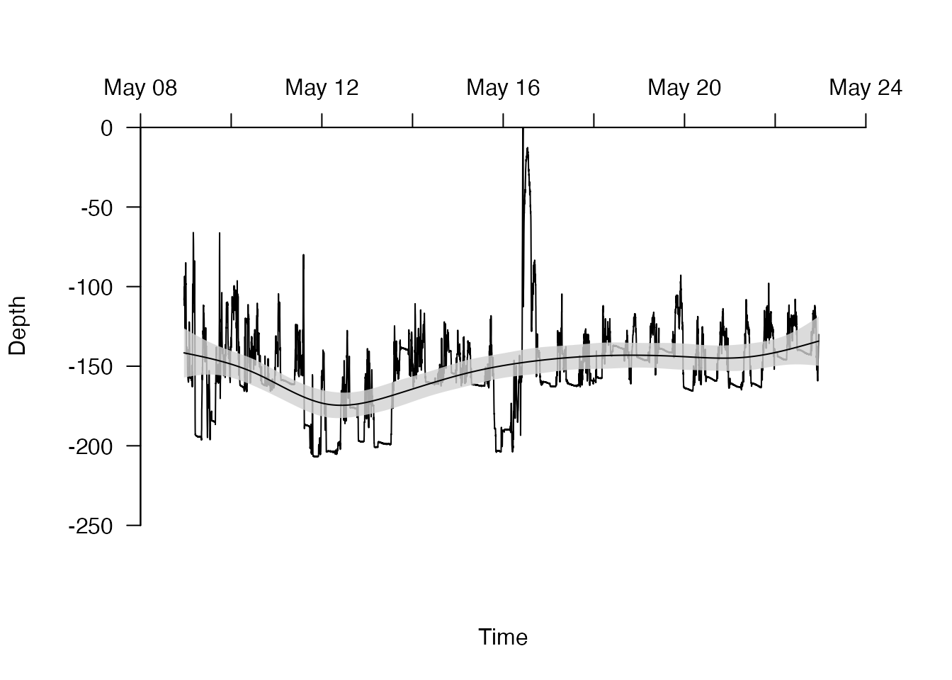
#> $`3`
#> $`3`$axis
#> $`3`$axis$las
#> [1] TRUE
#>
#> $`3`$axis$at
#> [1] "2016-05-08 UTC" "2016-05-10 UTC" "2016-05-12 UTC" "2016-05-14 UTC"
#> [5] "2016-05-16 UTC" "2016-05-18 UTC" "2016-05-20 UTC" "2016-05-22 UTC"
#> [9] "2016-05-24 UTC"
#>
#> $`3`$axis$side
#> [1] 3
#>
#> $`3`$axis$pos
#> [1] 0
#>
#>
#> $`3`$lim
#> [1] "2016-05-08 UTC" "2016-05-24 UTC"
#>
#>
#> $`2`
#> $`2`$axis
#> $`2`$axis$las
#> [1] TRUE
#>
#> $`2`$axis$at
#> [1] -250 -200 -150 -100  -50    0
#>
#> $`2`$axis$labels
#> [1] -250 -200 -150 -100  -50    0
#>
#> $`2`$axis$side
#> [1] 2
#>
#> $`2`$axis$pos
#> [1] "2016-05-08 UTC"
#>
#>
#> $`2`$lim
#> [1] -250    0
#> attr(,"user")
#> [1] FALSE FALSE
?list_CIs() and ?add_error_envelope() detail customisation options. In this case, our model reinforces our belief that the overall change in the mean depth is limited through time, although we would need to interrogate our model much more closely before putting too much confidence in its predictions (see below).
Model residuals: pretty_residuals()
To examine the extent to which model assumptions are met, residual diagnostic plots are instructive. These include standard diagnostic plots (i.e., residuals versus fitted values, residuals versus the linear predictor, a histogram of residuals and a quantile-quantile plot of residuals) as well as plots of residuals against covariates (vars, below) and, for time series, time stamps and autocorrelation functions (ACF) of residuals. This functionality is provided by pretty_residuals(), which plots standard diagnostic plots with pretty axes as well as residuals against one or more variables, time stamps and the ACF (if applicable).
pp <- par(mfrow = c(4, 2), oma = c(2, 2, 1, 1), mar = c(3, 3, 3, 3))
pretty_residuals(residuals = m1$std.rsd,
               fv = stats::fitted(m1),
               lp = stats::fitted(m1),
               vars = "temp",
               timestamp = "timestamp",
               dat = dat_flapper_thin,
               plot = 1:7
               )
#> plot (6) residuals ~ time stamp: 'timestamp_fct' is NULL; assuming 'dat' only contains one independent time series.
par(pp)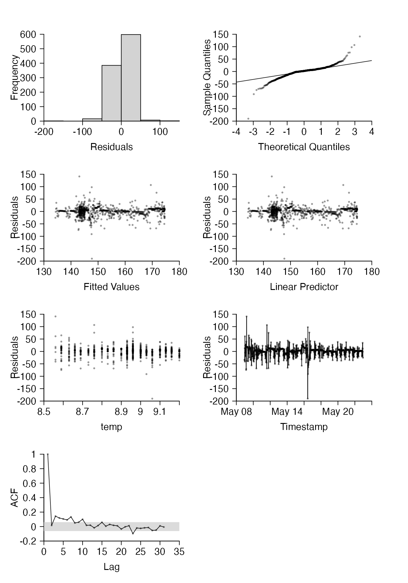
For large datasets, it can be helpful if some plots are based on random subset of residuals. For example, below we’ll use all residuals for most plots (some plots, like quantile-quantile plots, can be quite sensitive to the removal of data), but only plot a random sample of 50 % of residuals for plots 3 and 4, which show the residuals versus fitted values and the linear predictor. (In this case, the two plots are identical.)
pp <- par(mfrow = c(4, 2), oma = c(2, 2, 1, 1), mar = c(3, 3, 3, 3))
pretty_residuals(residuals = m1$std.rsd,
               fv = stats::fitted(m1),
               lp = stats::fitted(m1),
               vars = "temp",
               timestamp = "timestamp",
               dat = dat_flapper_thin,
               plot = 1:7,
               rand_pc = 50,
               plot_rand_pc = c(3, 4),
               )
#> plot (6) residuals ~ time stamp: 'timestamp_fct' is NULL; assuming 'dat' only contains one independent time series.
par(pp)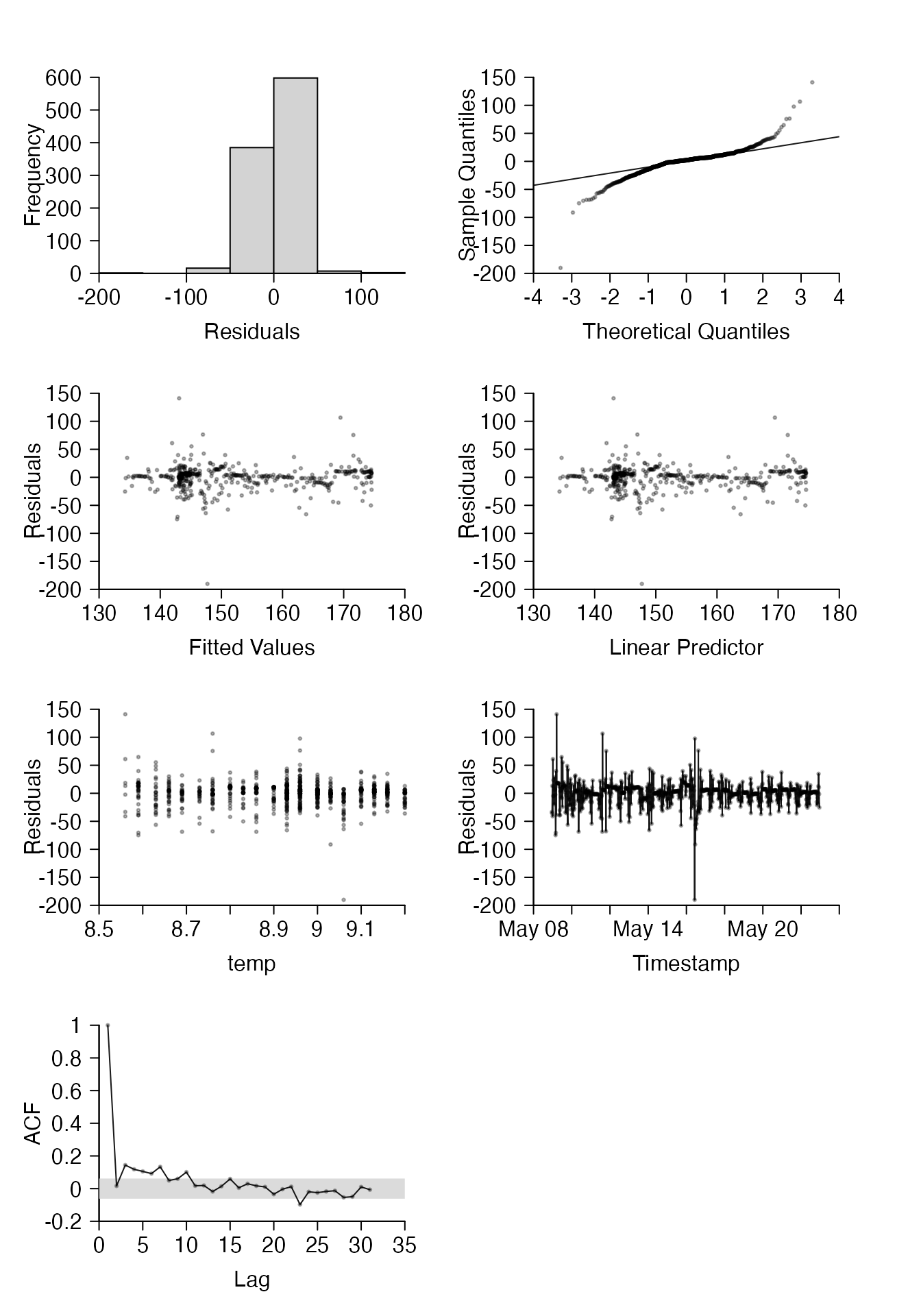
More details are given in ?pretty_residuals. For the example depth time series, these plots demonstrate that out model needs to be interpreted with caution: residuals versus fitted values, temperature and time stamp look reasonable, but the model has not perfectly captured the autocorrelation among residuals and the assumption of normality is clearly violated.
Common plotting functions
prettyGraphics contains some integrative functions which implement some of the building blocks described above for particular purposes, with more or less generality. Examples include pretty_plot(), which is very like graphics::plot() but uses the power of pretty_axis() to make the axes and can handle several function types (e.g. stats::qqnorm(), see below), pretty_hist() and pretty_density() which produce histograms and density plots (which can be useful in data exploration and model diagnostics) and other functions.
The standard plotting function: pretty_plot()
pretty_plot() is a general function which produces plots with pretty axes. This operates like graphics::plot(), with a few differences:
-
Axes. Axes are controlled by
pretty_axis()viapretty_axis_args, which ensures they are always appropriately placed. -
Axis labels. Labels can be added to a plot using
xlab,ylabandmain, as usual, or withgraphics::mtext()via themtext_argsargument, which offers more flexibility. -
Plot functions. Several plotting functions can be used via the specification of a function,
fandplot_xy, which describes whether the function takes in thexorycoordinates or both (for examplestats::qqnorm()usesyalone, see below). -
Graphics. Points and lines can be added to a plot by supplying the usual arguments (e.g.
pch), or via named lists of arguments (points_argsorlines_args) passed tographics::points()orgraphics::lines().
For example, we can re-create a pretty version of our depth time series plots, with most of the work (e.g. definition of suitable axes based on user inputs) implemented internally, via:
pretty_plot(x = df$timestamp,
            y = df$depth,
            type = "l",
            pretty_axis_args = list(side = c(3, 2), pretty = list(n = 5), axis = list(las = TRUE)),
            xlab = "", ylab = "",
            mtext_args =
              list(
                list(side = 3, text = "Time", line = 2),
                list(side = 2, text = "Depth (m)", line = 3)
                )
            )
pretty_plot() can use some other functions, like stats::qqnorm(), which is implemented under-the-hood in pretty_residuals(), as follows:
pp <- par(mfrow = c(1, 2))
qqnorm(m1$std.rsd)
qq <- qqnorm(m1$std.rsd, plot = FALSE)
pretty_plot(x = qq$x,
            y = qq$y,
            plot_xy = "y",
            f = stats::qqnorm,
            pretty_axis_args = list(side = 1:2, pretty = list(n = 5), axis = list(las = TRUE)),
            xlab = "", ylab = "",
            mtext_args = list(
                list(side = 1, text = "Theoretical Quantiles", line = 2),
                list(side = 2, text = "Sample Quantiles", line = 3)
                )
            )
par(pp)
Histograms and density plots: pretty_hist() and pretty_curve()
Histograms and density plots are also useful components of data exploration and/or modelling diagnostics. Below, I use pretty_hist() to create a histogram of the distribution of depths and pretty_curve() to explore the distribution of observed data in relation to a Gaussian distribution with parameters estimated by the model above:
#### Plotting window
pp <- par(mfrow = c(1, 2))

#### pretty histogram
pretty_hist(df$depth)

#### pretty density plot
pretty_curve(x = df$depth,
             f = stats::dnorm,
             param = list(mean = coef(m1)[1], sd = sigma(m1)),
             add_rug = list(col = "skyblue", lwd = 1)
             )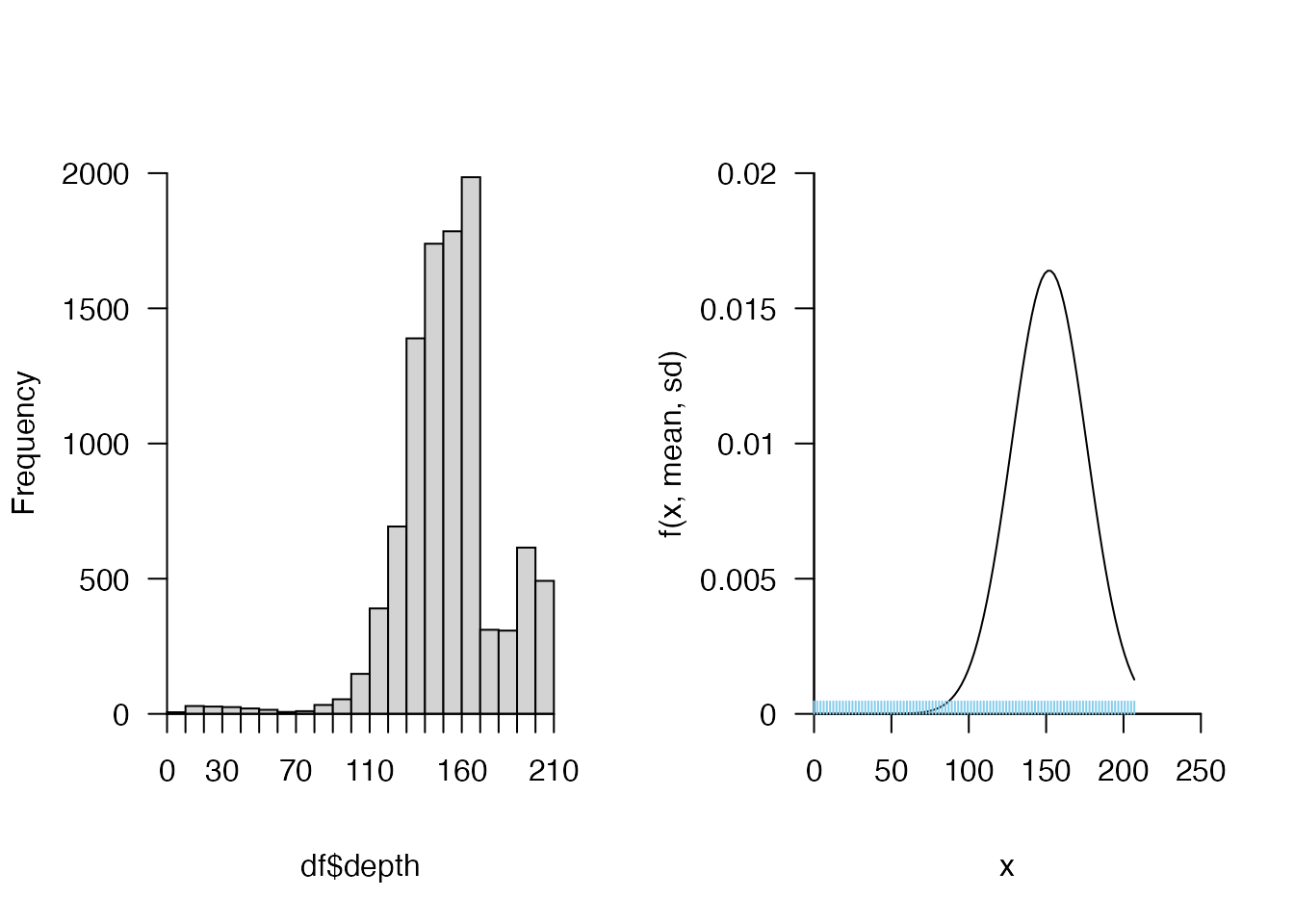
par(pp)
Boxplots: pretty_boxplot()
For factor data, boxplots are often particularly informative, and these can be implemented via pretty_boxplot(). For example, we could explore the distribution of depths occupied by the two sampled individuals as follows:
pretty_boxplot(dat_flapper$id, dat_flapper$depth, xlab = "ID", ylab = "Depth (m)")
#> pretty$n greater than the number of factor levels; resetting n to be the total number of factor levels.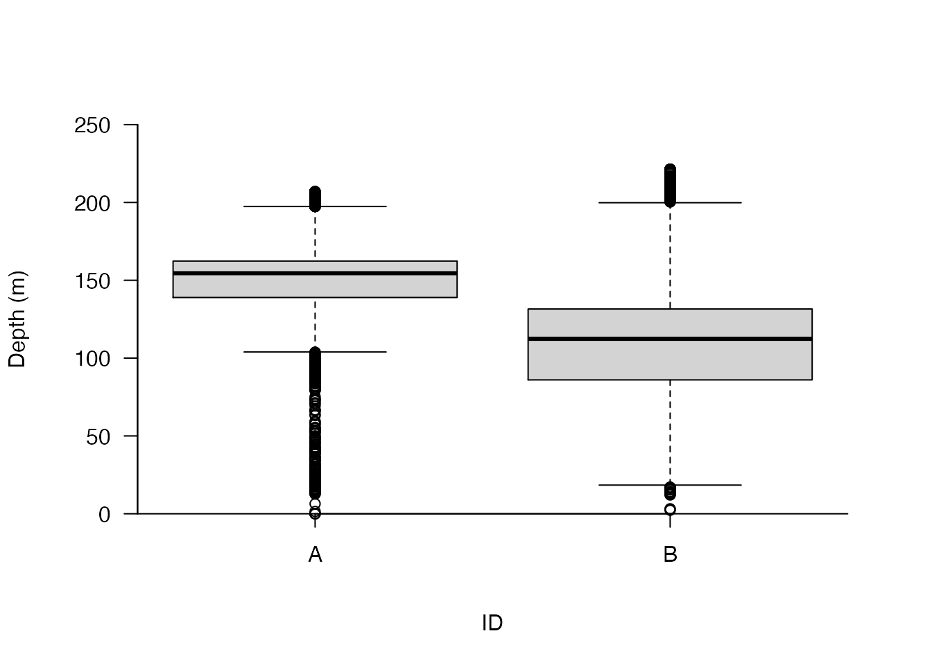
Temporal data
Alongside some standard plotting functions, prettyGraphics includes some functions designed to facilitate visualisation of other data types, such as temporal data, spatial data.
Number lines and timelines: pretty_line()
In some cases, one dimensional visualisation of observations, especially those collected through time, can be useful. For example, we could view a timeline of the depth time series observations as follows:
pretty_line(df$timestamp, pch = 21, col = "red", bg = "red", cex = 0.1)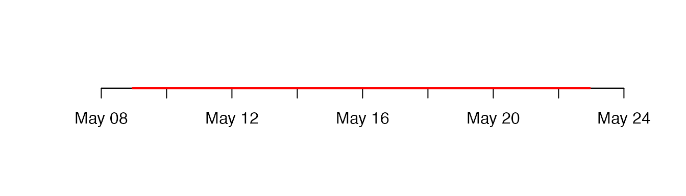
This kind of approach is particularly useful for presence or presence/absence observations collected through time. ?pretty_line() provides further information and examples, including exemplifying the addition of one dimensional number lines or timelines to existing plots.
Time series plot: pretty_ts()
For time series data, pretty_ts() links most of the building blocks described above to streamline the creation of complex plots. See ?pretty_ts() for examples. vis_ts() is an extension of pretty_ts() into an interactive environment which facilitates rapid data exploration and the production of publication-quality plots for time series data via an R Shiny-Dashboard interface.
Spatial data
For spatial data, functionality is currently limited but may be expanded in the future. At present, pretty_scape_3d() and vis_scape_3d() can be used to visualise landscapes in 3d. For example, we could visualise the bathymetric landscape in the area from which flapper skate depth time series were sampled using the following example bathymetry data, included as a raster in prettyGraphics, sourced from GEBCO:
# Extract raster
r <- dat_gebco
# Define 'depths' greater than 0 to be 0 (i.e., 'surface') to focus on the underwater landscape
r[r[] > 0] <- 0
# Convert raster to UTM coordinates
r <- raster::projectRaster(r, crs = sp::CRS("+proj=utm +zone=29 ellps=WGS84"))
# Visualise landscape on the scale of the data
pretty_scape_3d(r = r,
                stretch = 50,
                aspectmode = "data")
(The figure is hidden to minimise vignette file size.) For further options, see ?pretty_scape_3d and ?vis_scape_3d.
Conclusions
prettyGraphics is an R package designed to make common data exploration tasks and plot production for continuous data easier and more flexible. This vignette has introduced some of the main functions; more details are available in the package reference manual. pretty_axis() is an especially useful function in the creation of publication quality plots in base R. The subsequent addition of lines, colour bars, statistical summaries, shading and model predictions adds value to data exploration and publication-quality plots, but can be surprisingly difficult with base R. prettyGraphics facilitates these operations. Functions can be used sequentially or via integrative functions, such as pretty_plot(). These operate similarly to functions in base R but harness some of the power of building block functions to create improved plots.
Future developments
prettyGraphics has been designed especially for continuous responses and explanatory variables, although some functions (e.g. add_shading_bar()) help with discrete variables or factors. This functionality may be expanded in due course. Suggestions are welcome. However, the principle motivation for prettyGraphics remains the requirements of (ecological) research, which means that prettyGraphics does not aspire to provide the level of comprehensive functionality of other plotting packages (e.g. ggplot2, plotly).
Acknowledgements
This work was conducted during a PhD Studentship at the University of St Andrews, jointly funded by Scottish Natural Heritage, through the Marine Alliance for Science and Technology for Scotland (MASTS), and the Centre for Research into Ecological and Environmental Modelling. EL is a member of the MASTS Graduate School.
Centre for Research into Ecological and Environmental Modelling, The Observatory, University of St Andrews, St Andrews, Scotland, KY16 9LZ and Scottish Oceans Institute, East Sands, University of St Andrews, St Andrews, Scotland, KY16 8LB, el72@st-andrews.ac.uk↩︎